ShmoopTube
Where Monty Python meets your 10th grade teacher.
Search Thousands of Shmoop Videos
ACT Science Videos 67 videos
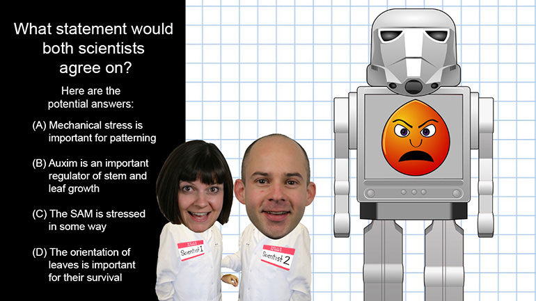
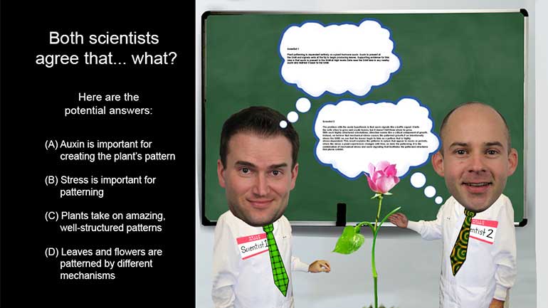
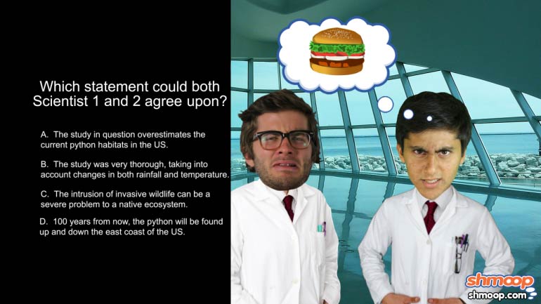
ACT Science: Conflicting Viewpoint Passage Drill 1, Problem 1. What statement would both scientists agree upon?
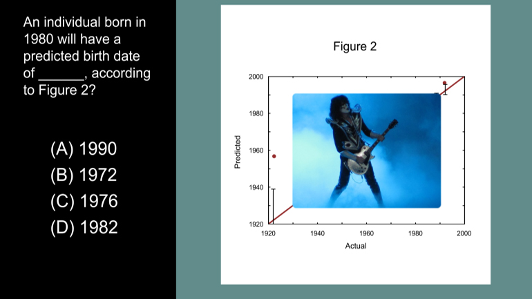
ACT Science Data Representation Passage: Drill 3, Problem 5. According to Figure 2, what birth date will be predicted for an individual actual...
ACT Science: Data Representation Passage Drill 1, Problem 2. Which of the following is a variable in Figure 1, but not in Figure 2?
Suggestive Statistics 775 Views
Share It!
Description:
ACT Science: Data Representation Passage Drill 1, Problem 1. What do the statistics in Figure 1 suggest?
Transcript
- 00:03
A little birdie told us you wanted a shmoopy problem to solve... and we shall provide.
- 00:08
Included below in Figure 1 are some salary statistics by year from Major League Baseball.
- 00:14
Figure 1 suggests that... what?
- 00:18
And here's some potential answers...
- 00:23
What is the question asking?
Full Transcript
- 00:24
Basically, it just wants to know if we can interpret what it means when those bars in
- 00:28
the graph keep getting bigger and bigger...
- 00:31
Okay, so based on the graph, what do we know about the average player
- 00:35
salaries and the minimum wage?
- 00:37
Are they increasing, decreasing, or staying the same?
- 00:40
Well, they're definitely not staying the same. Otherwise, all of the bars would be
- 00:43
the same height.
- 00:45
The bars are getting taller year after year, so we can cross off option D.
- 00:49
Now let's check out the legend, or key of the graph.
- 00:53
The red parts of the bars indicate the average salary, and the green is the minimum wage
- 00:58
for the MLB. Very festive. Focus on the tiny green part on the bottom
- 01:02
of the graph... is it changing over time?
- 01:04
It sure is. It's getting higher... so we can get rid of option A that says only the
- 01:09
AVERAGE wage is getting higher, not the minimum wage.
- 01:12
Next, the red part of the graph. Is it getting higher over time?
- 01:17
Yup, the red part is definitely increasing. So option B is our answer.
- 01:21
Both the average wage and the minimum wage increase over time.
- 01:25
And good thing, too. Considering how bad inflation is.
Related Videos
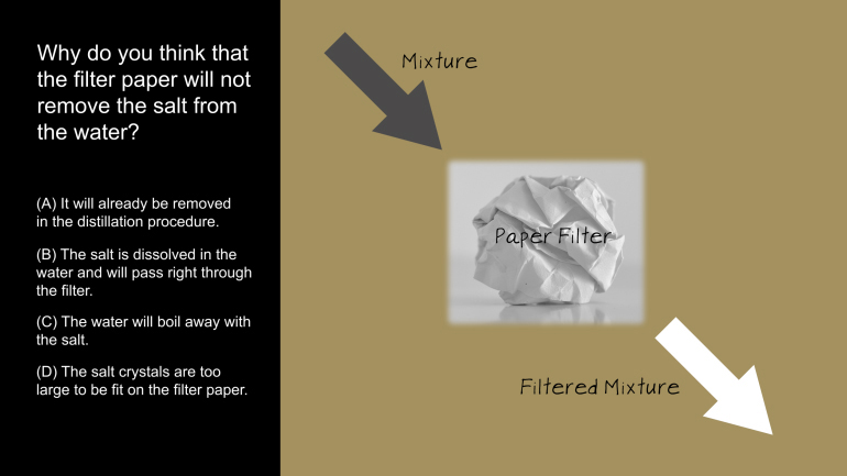
ACT Science: Research Summary Passage Drill 2, Problem 1. Why do you think that the filter paper will not remove the salt from the water?
ACT Science: Conflicting Viewpoint Passage Drill 1, Problem 1. What statement would both scientists agree upon?
ACT Science: Data Representation Passage Drill 1, Problem 2. Which of the following is a variable in Figure 1, but not in Figure 2?
ACT Science Data Representation Passage: Drill 3, Problem 5. According to Figure 2, what birth date will be predicted for an individual actual...
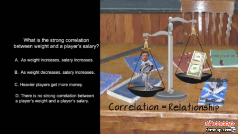
ACT Science: Data Representation Passage Drill 1, Problem 3. What is the strong correlation between weight and a player's salary?
